GWI
2022
GWI is a leading audience-targeting company in the global marketing industry. For its international 2022 advertising campaign, Truant London was tasked with showcasing its services. I created glitching OOH, digital assets shown across screens in New York and London. My role was to help create a glitching typography effect that could represent the company's digital background. I used a combination of VDMX software and after effects to demonstrate to an animation studio how we wanted the motion assets to look. Following the first part of the campaign, I have been solely responsible for creating large format out-of-home assets for the GWI Australia and LA campaigns.
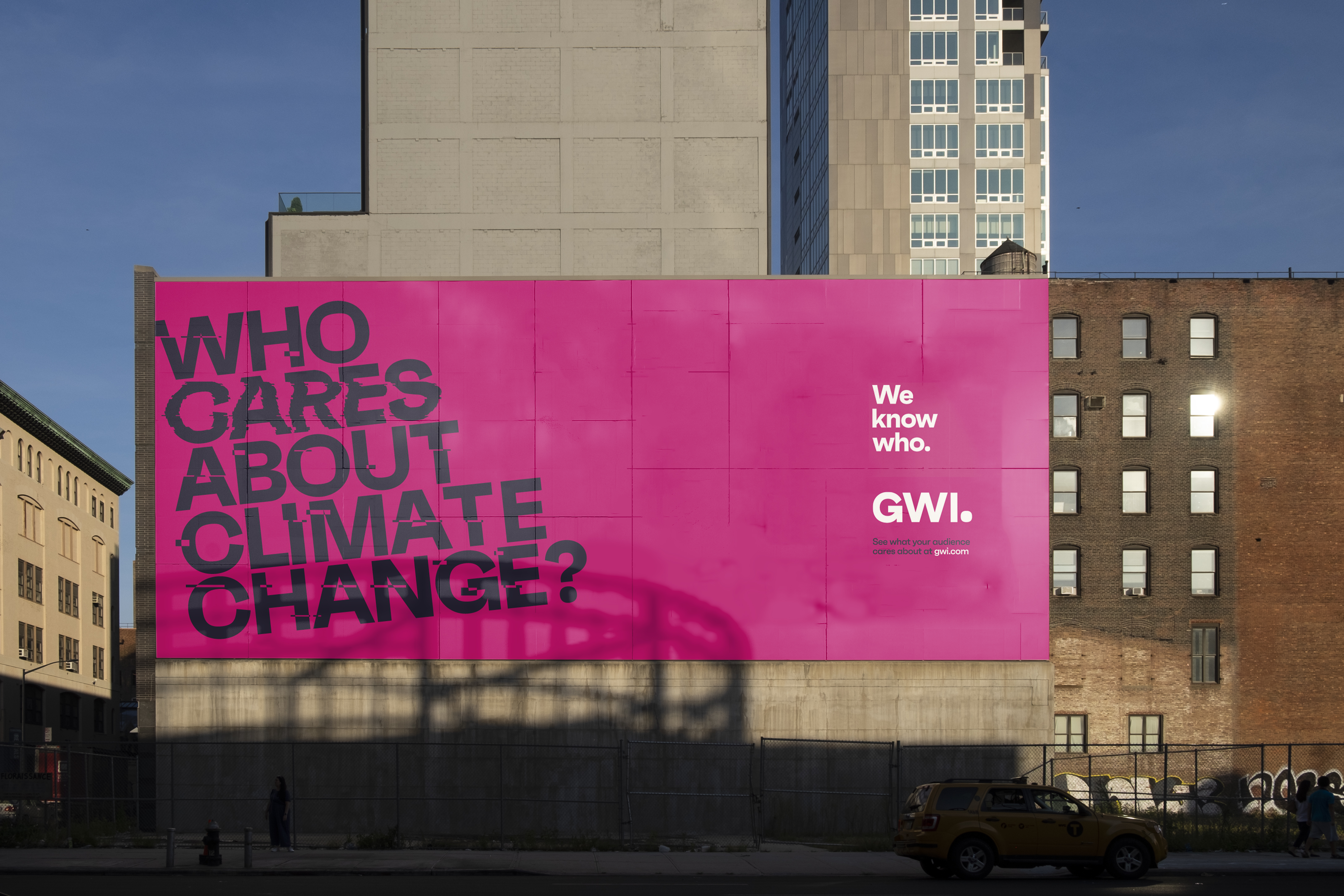


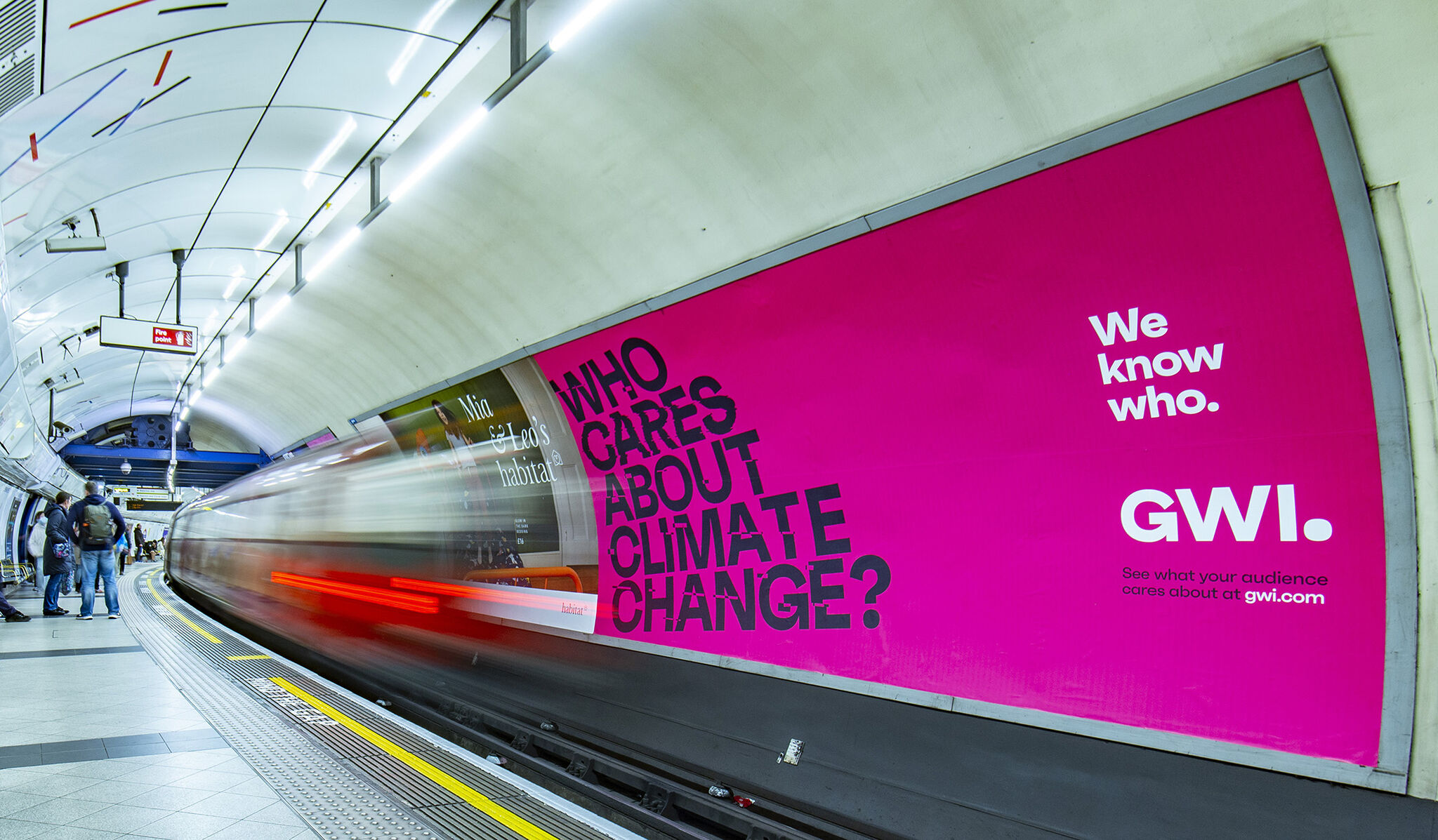
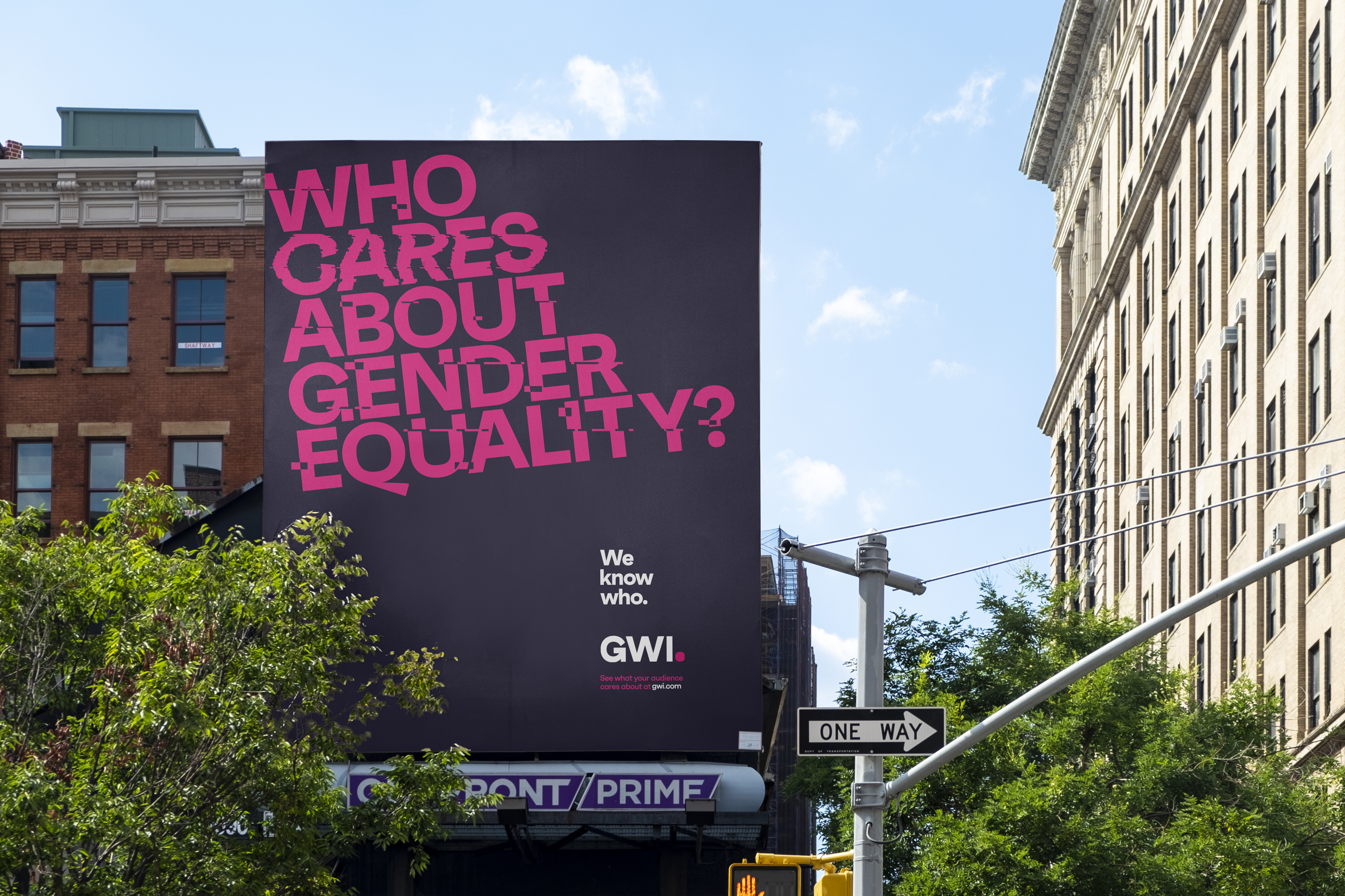
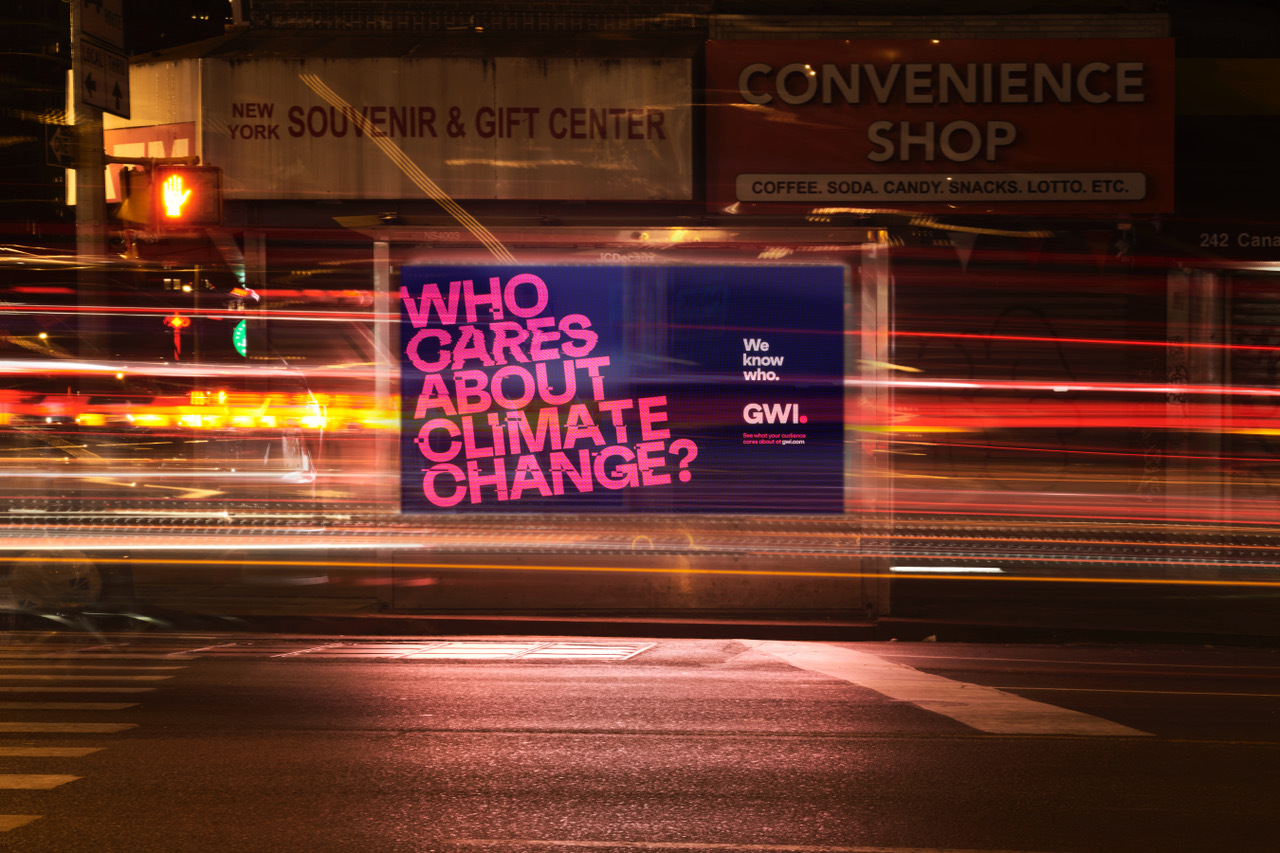
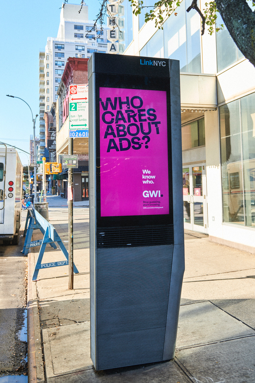

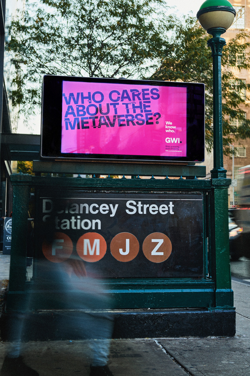
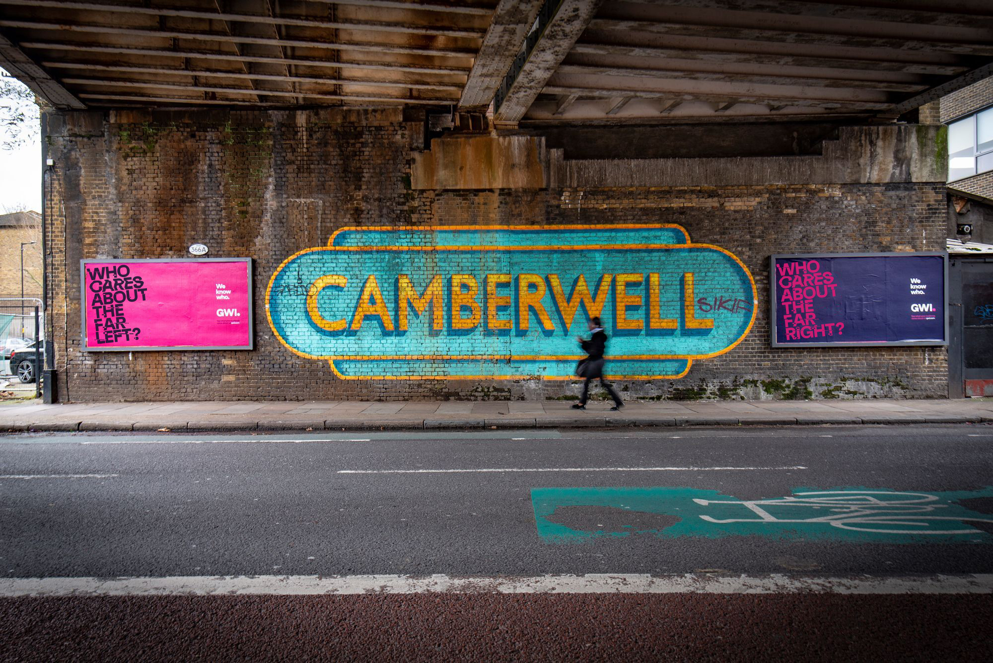
Below is a video displaying some experimentation I created and demonstrates some of the techniques used to create the glitching type.
Unity
2021 - Current
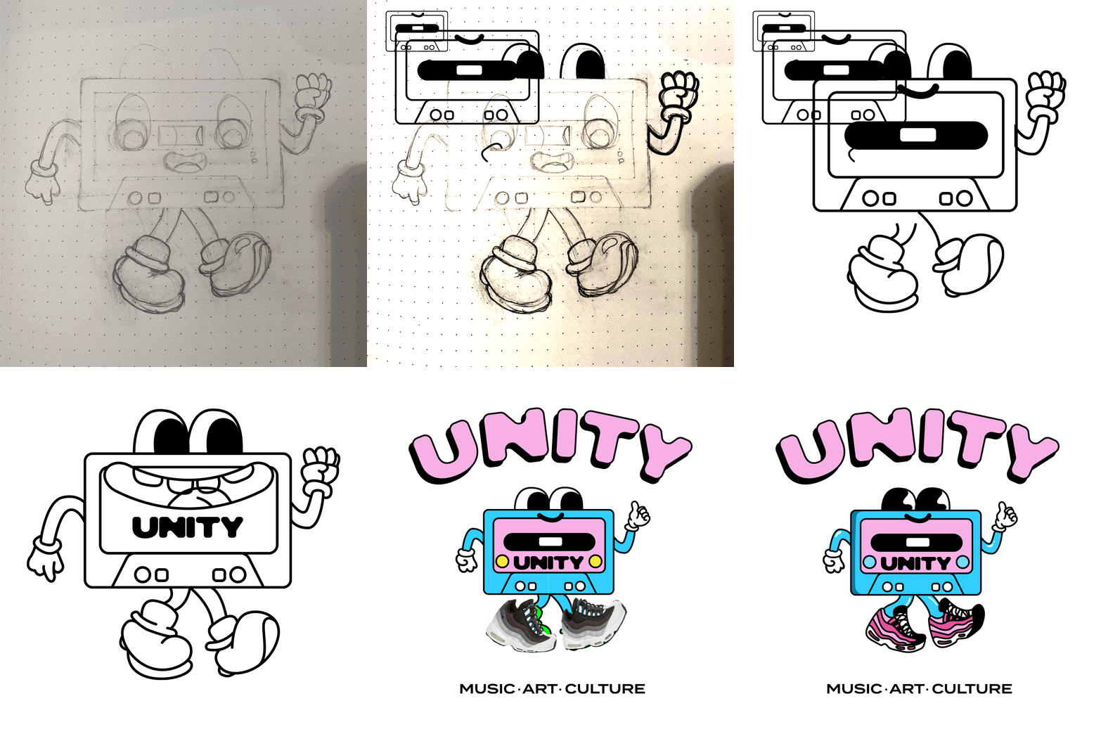
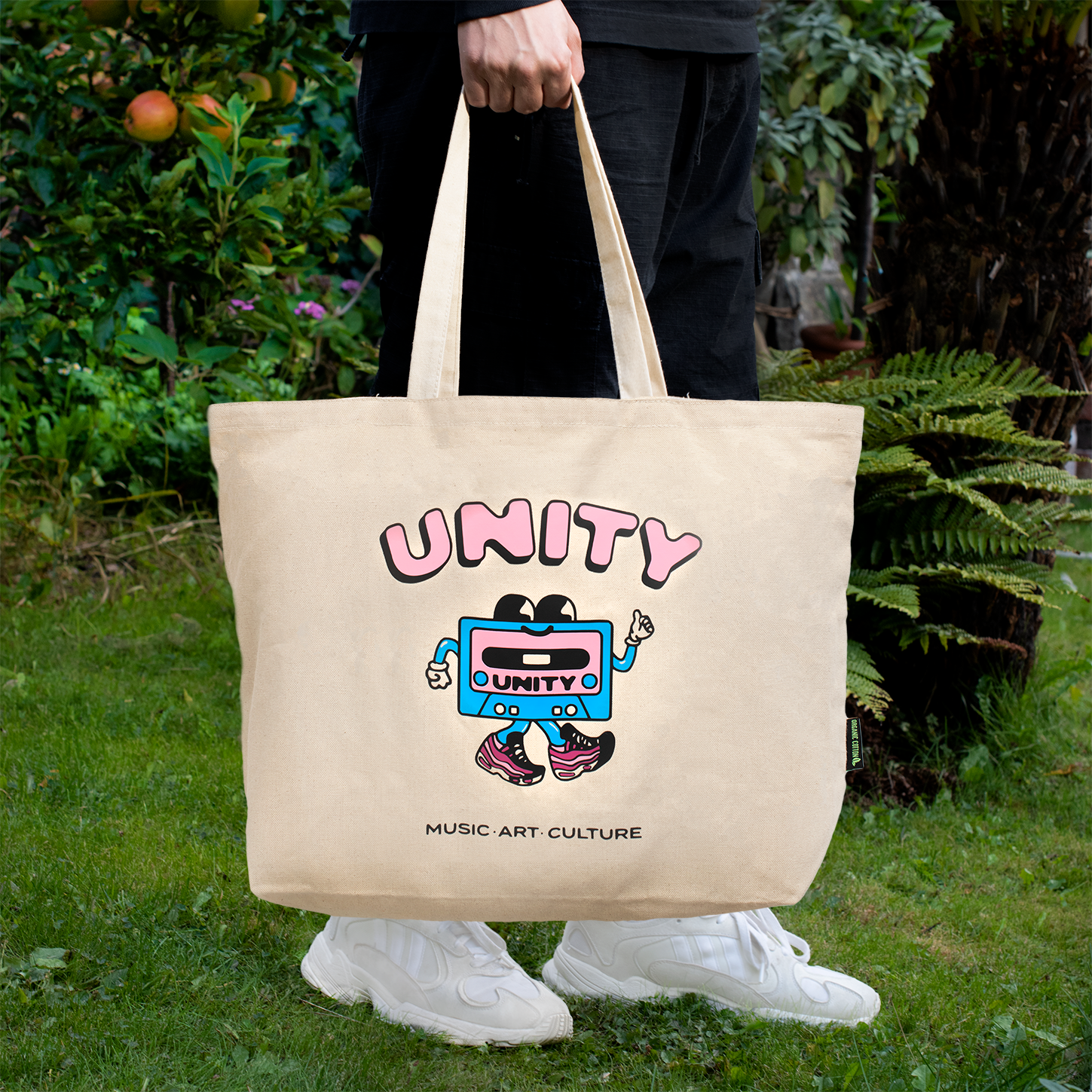
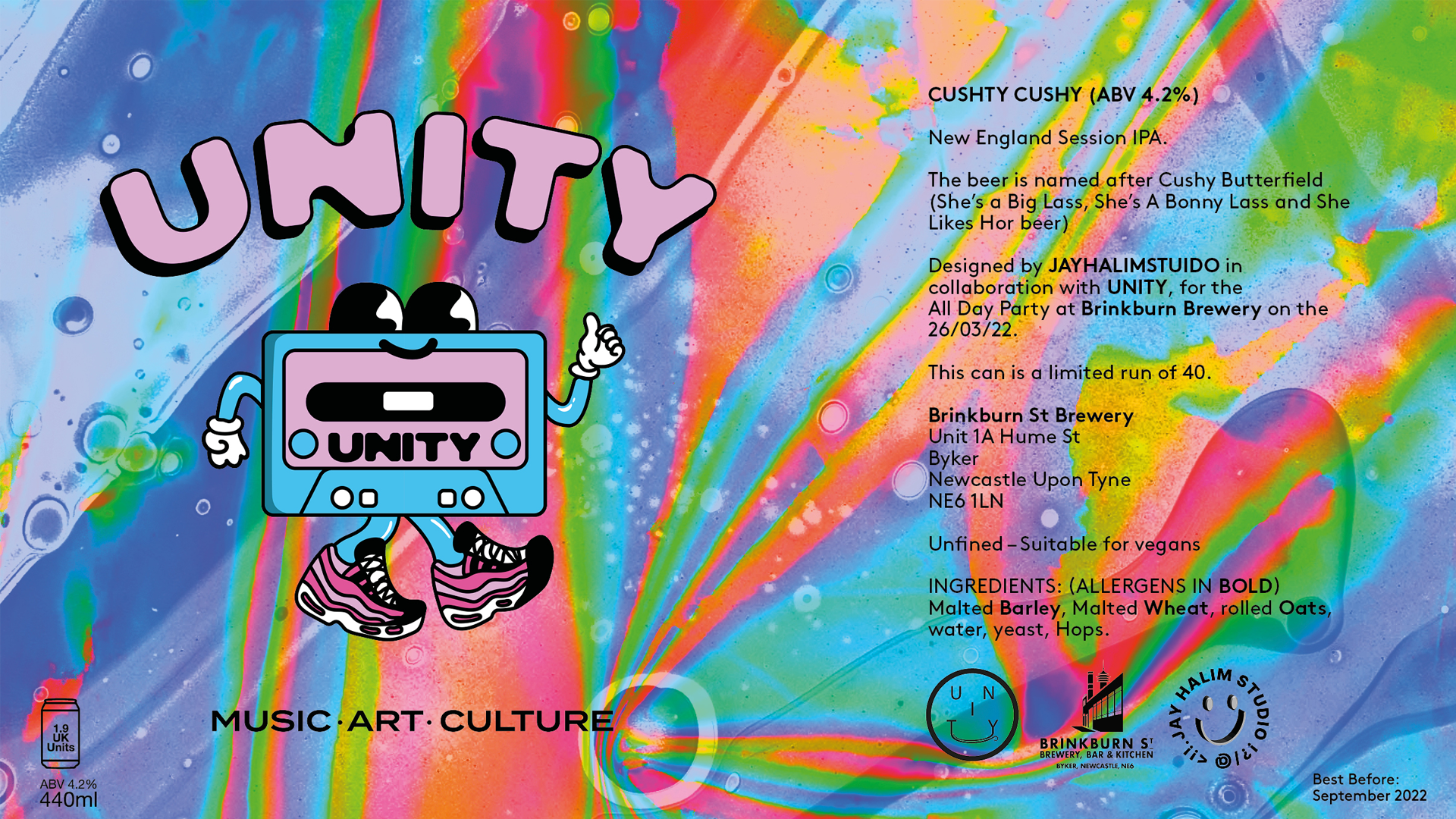
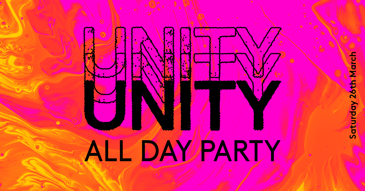
Unity is an independent music, arts and culture events organisation based in Newcastle Upon Tyne. Since 2021 Unity has commissioned social media, merchandise and print designs for their upcoming events.
Character merchandise and branding design



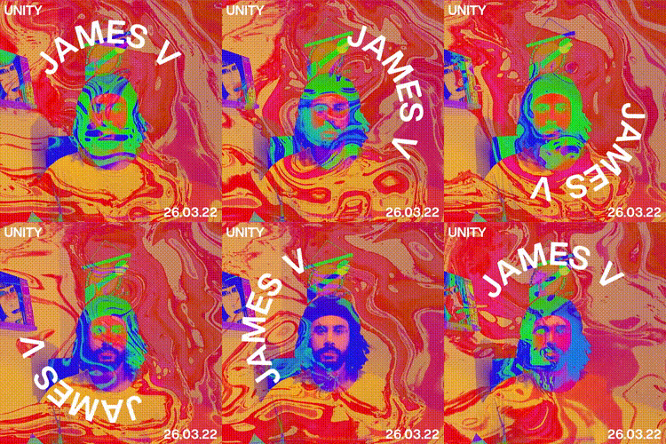
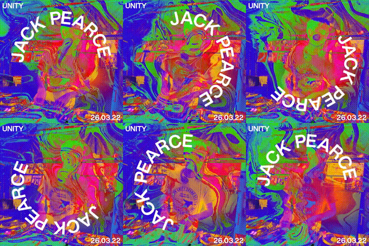
Artist profiles animation

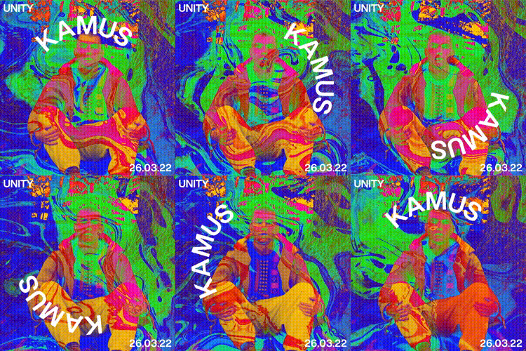
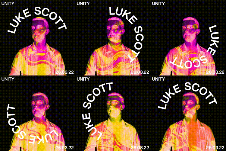
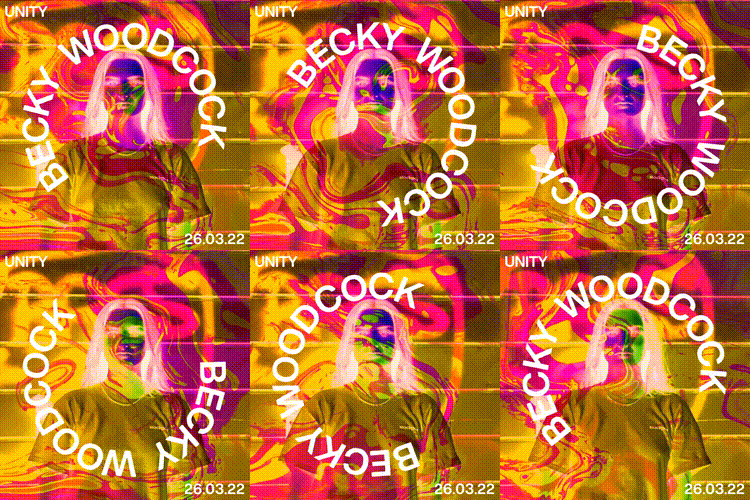
Promotional Video and socials
Rockstar Energy - Press Play
2023
As the sole designer on the Rockstar Energy Drink campaign at Truant London, I had the incredible opportunity to lead the creative direction for a one-of-a-kind music event. The event, held at a secret venue, was promoted by renowned artists like MistaJam, RAYE, and Tom Cullen, who engaged their fans on social media, building anticipation and excitement. My role encompassed the full spectrum of event branding, from crafting eye-catching digital content for social media and email campaigns to designing immersive projection visuals on the building and impactful artwork inside the venue. This multi-channel campaign seamlessly blended digital, print, and out-of-home elements, creating a cohesive and electrifying experience that truly captured the essence of the Rockstar brand.


Shipyard
2020
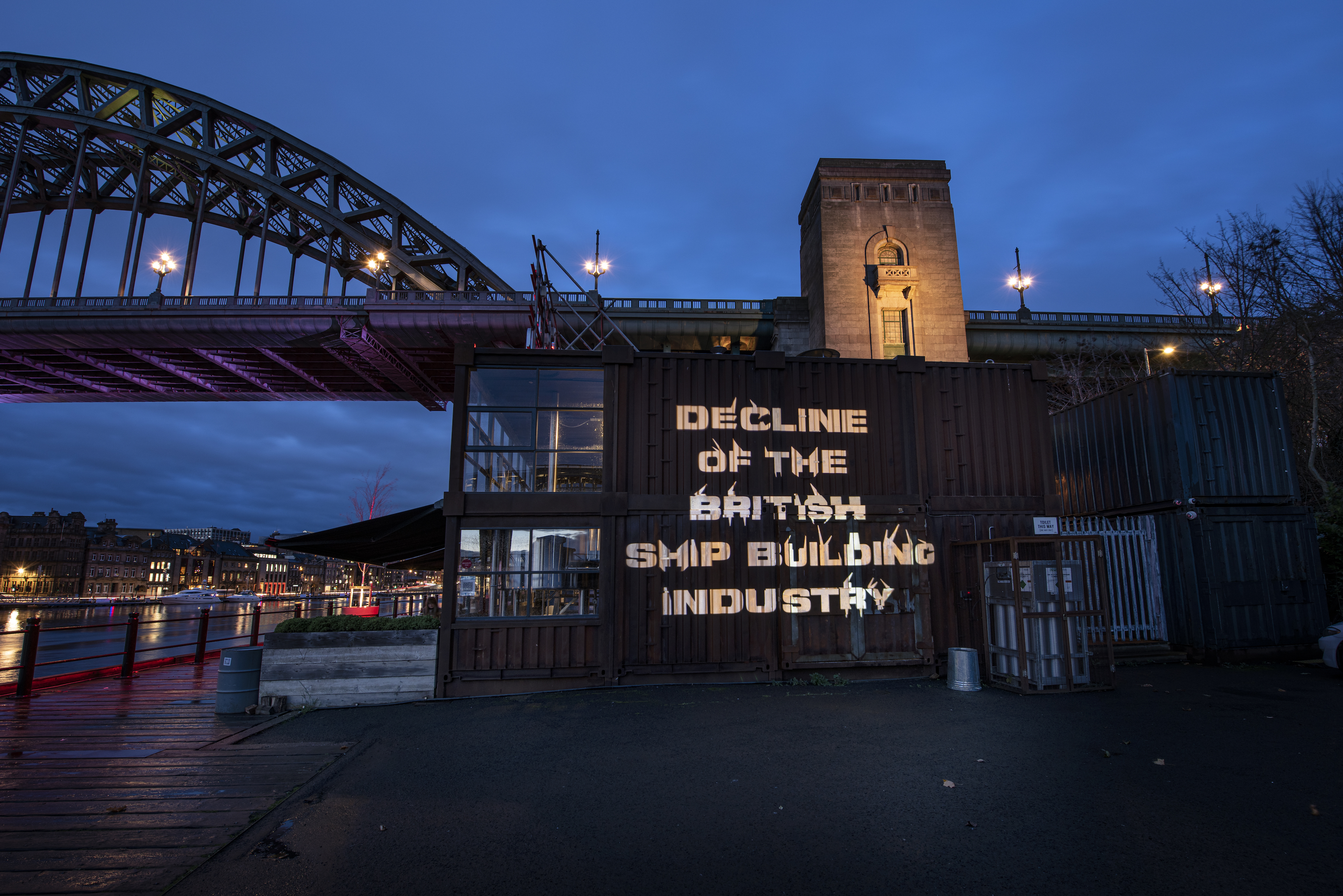
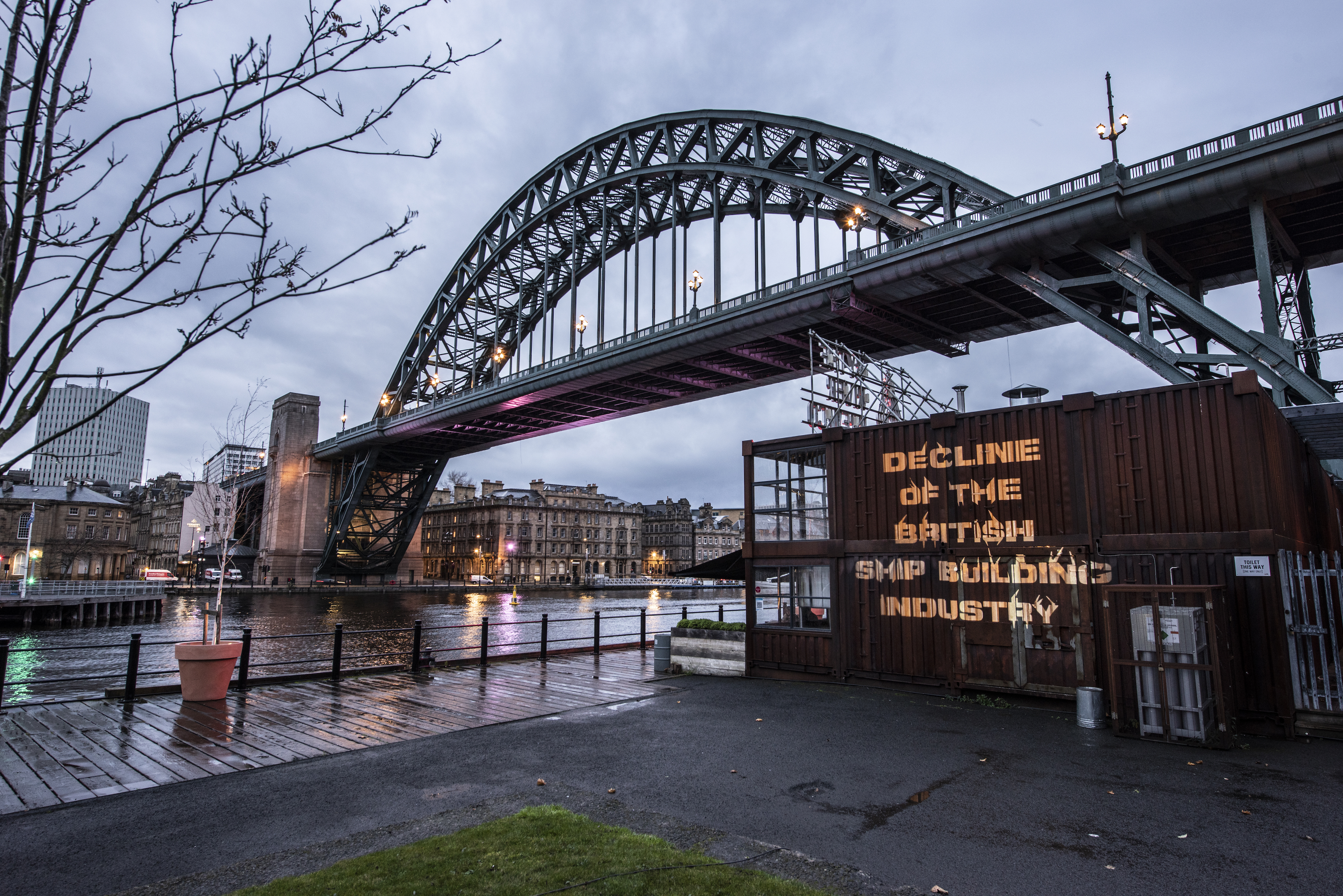
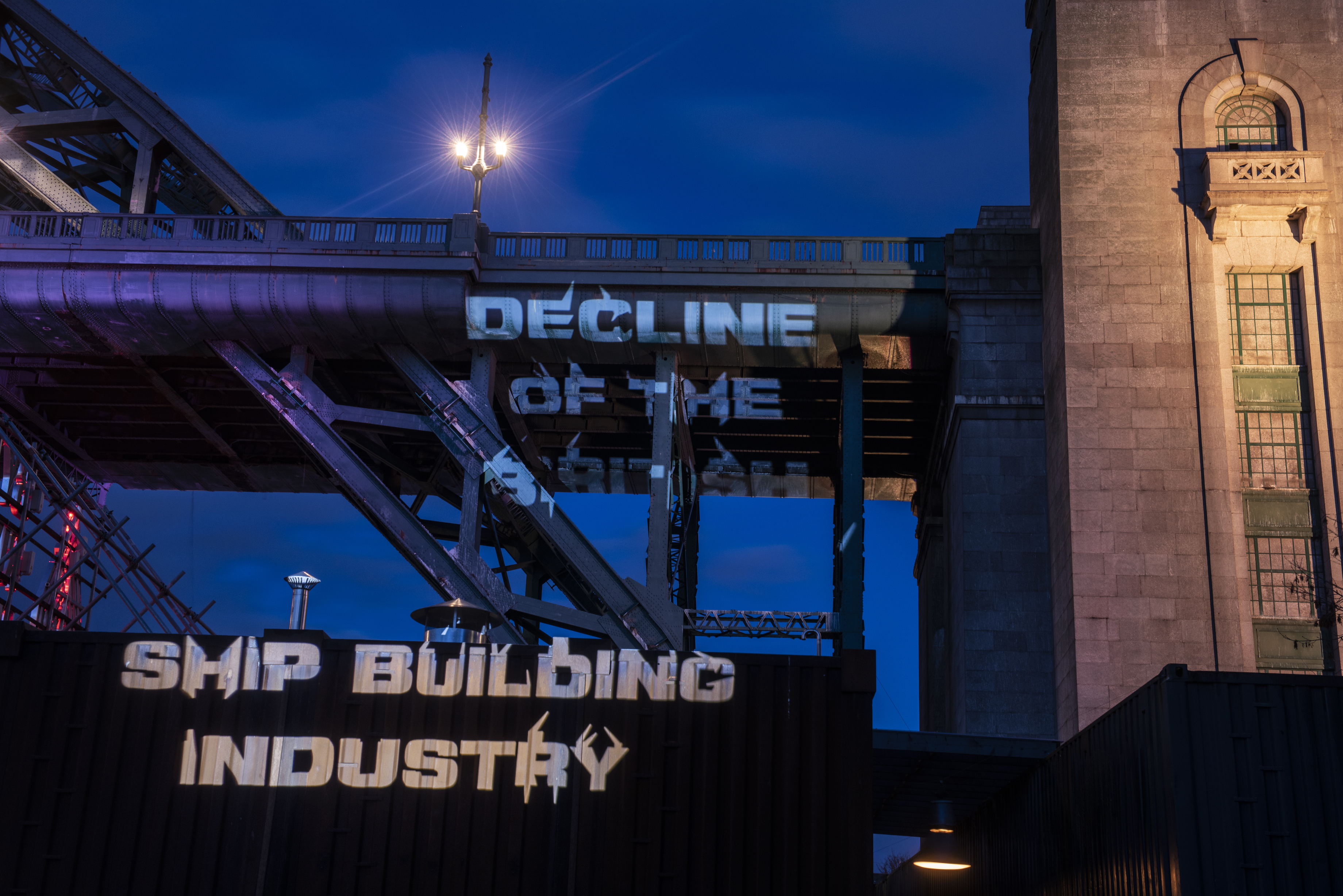
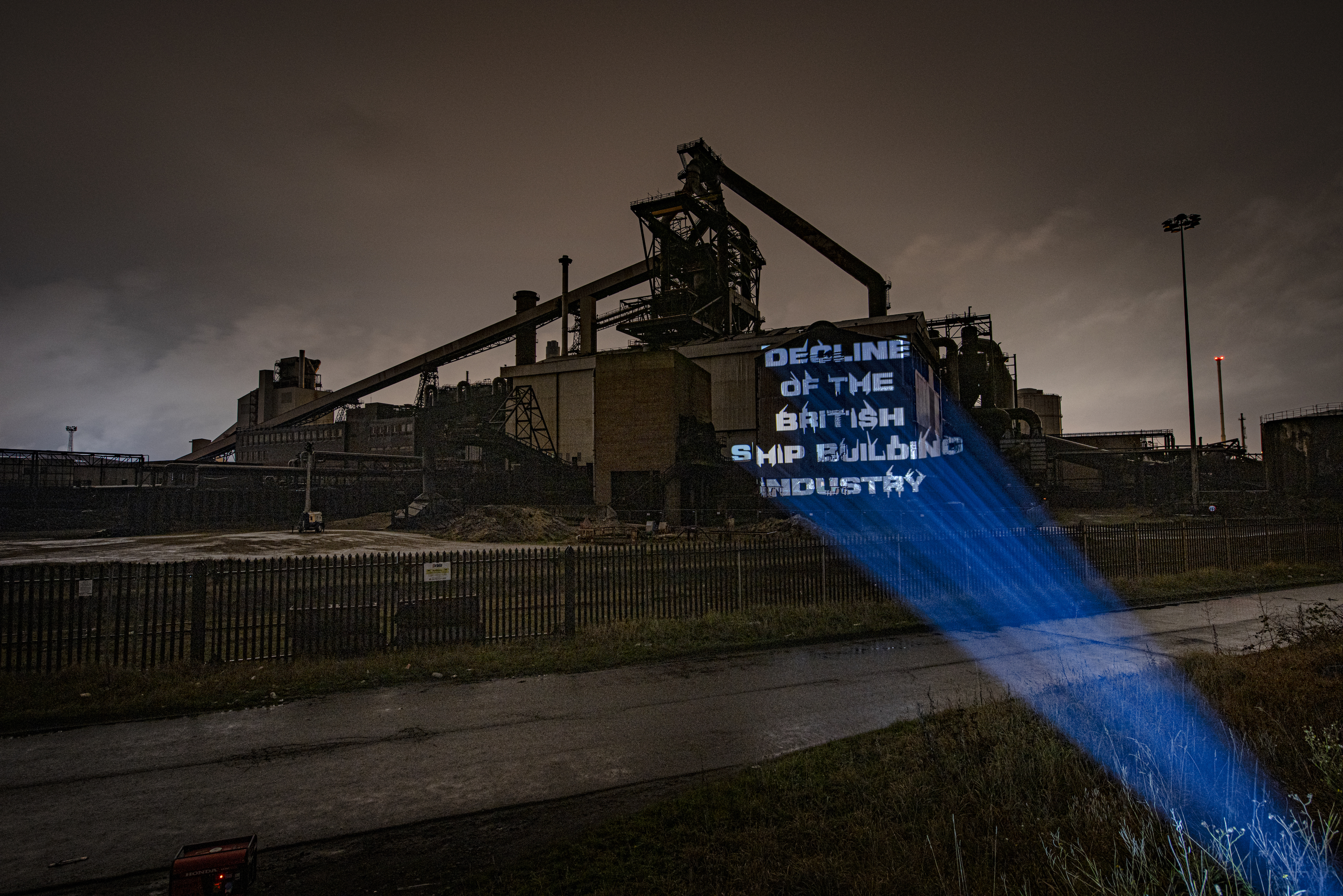
‘Shipyard’ is a typeface designed and projected by Jay Halim Davison, inspired by the effects of the declining industrial industries and Thatcherism in the North of England.
Made up from a combination of three fonts including Helvetica Bold, Eurostile Bold and Microgramma D Bold Extended, the typeface is a representation of classic ship typography. Using Glyphs to generate extrusions that mimic crane-like structures, Shipyard is a usable and variable typeface.
The final typeface was projected around Newcastle and Middlesbrough to create a type specimen that aimed to evoke response in regards to the declining industrial industries of the North.
Designer Statement
This was quite a personal project for me. Having grown up surrounded by disused shipyards and empty concrete spaces that were once buzzing with activity, it is clear that this topic has always been an interest which was rooted in my upbringing. From an early age I have had a curiosity surrounding shipyards and areas such as Willington Quay, on the banks of the River Tyne between my hometown North Shields and Wallsend. These particular areas of interest stemmed from the fact my Dad, a commercial photographer, would often work for companies such as Amec and Swan Hunters. My dad would have the job of visually documenting different construction processes within local shipyards, passing down an interest in steel structures and the shipping industry to me. In his free time my dad would often take me on drives to see cranes, offshore jackets and occasionally if a large ship was docking on the Tyne.
Interestingly, during this project I discovered that my Grandad once worked for a company called Coles, which was based in Sunderland. Coles was once one of the largest crane manufacturing companies in the world, before its closure in 1984. After his time in the merchant navy as a chief engineer, he then went on to design cranes whilst working as an engineer draughtsman for Coles. After more digging into family history on my Dad’s side, I found documentation and photographs of my Great Grandad who lived and worked on the banks of the Tyne, working as a boat builder. It began to occur to me that an interest and passion in various maritime and constructional sectors was a generational occurrence, and rightly so, as this industry was so deeply significant to the working class population of the North-East of England, pre and post-Thatcherism.
Family Photographs


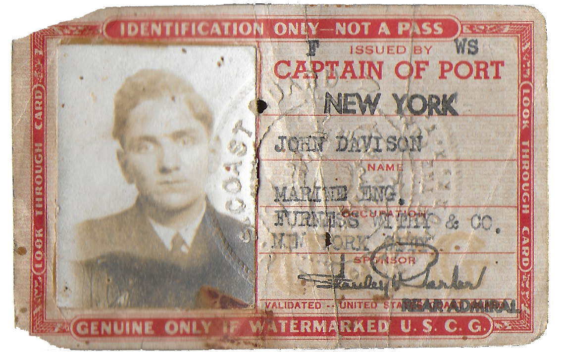
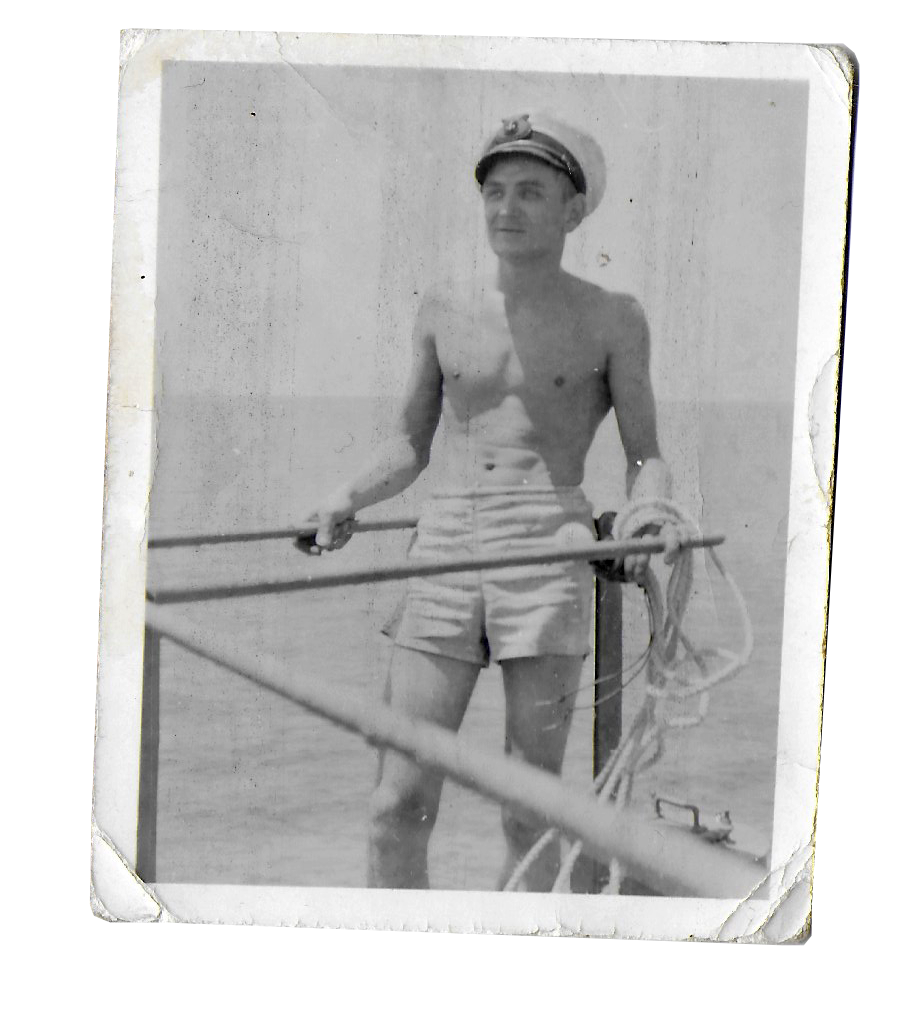
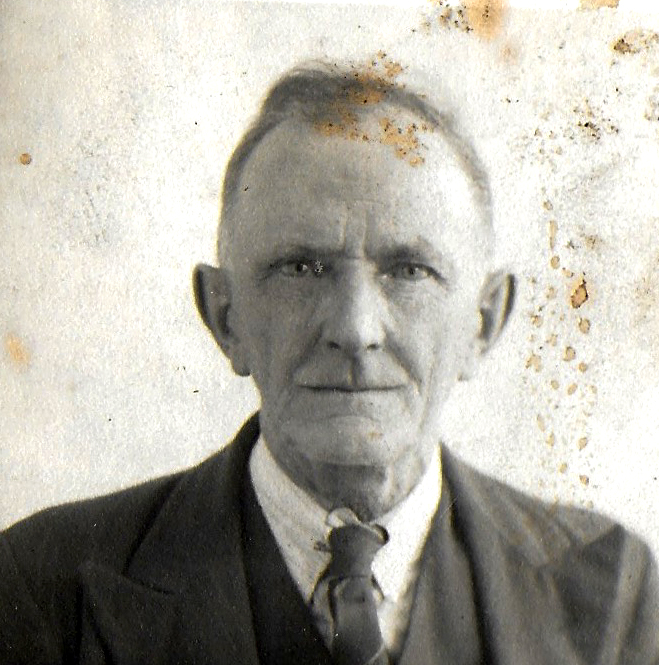


Shipyard Film
Shipyard Variable Examples
Behind The Scenes


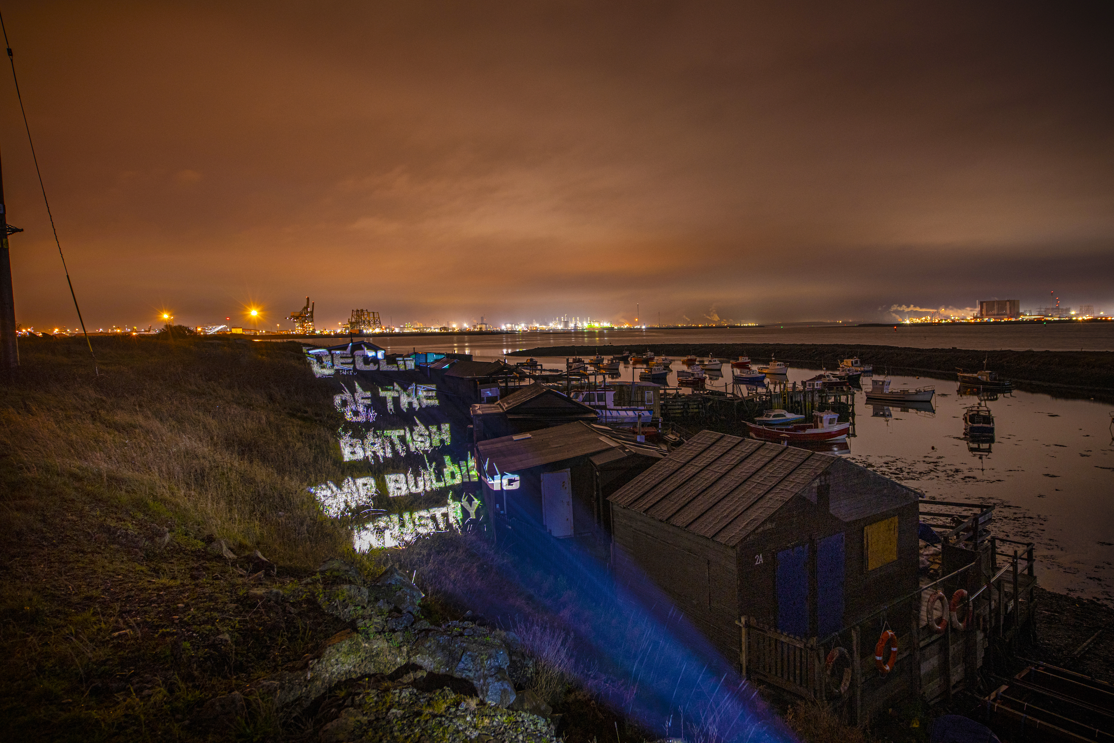





Canny Curries
2021
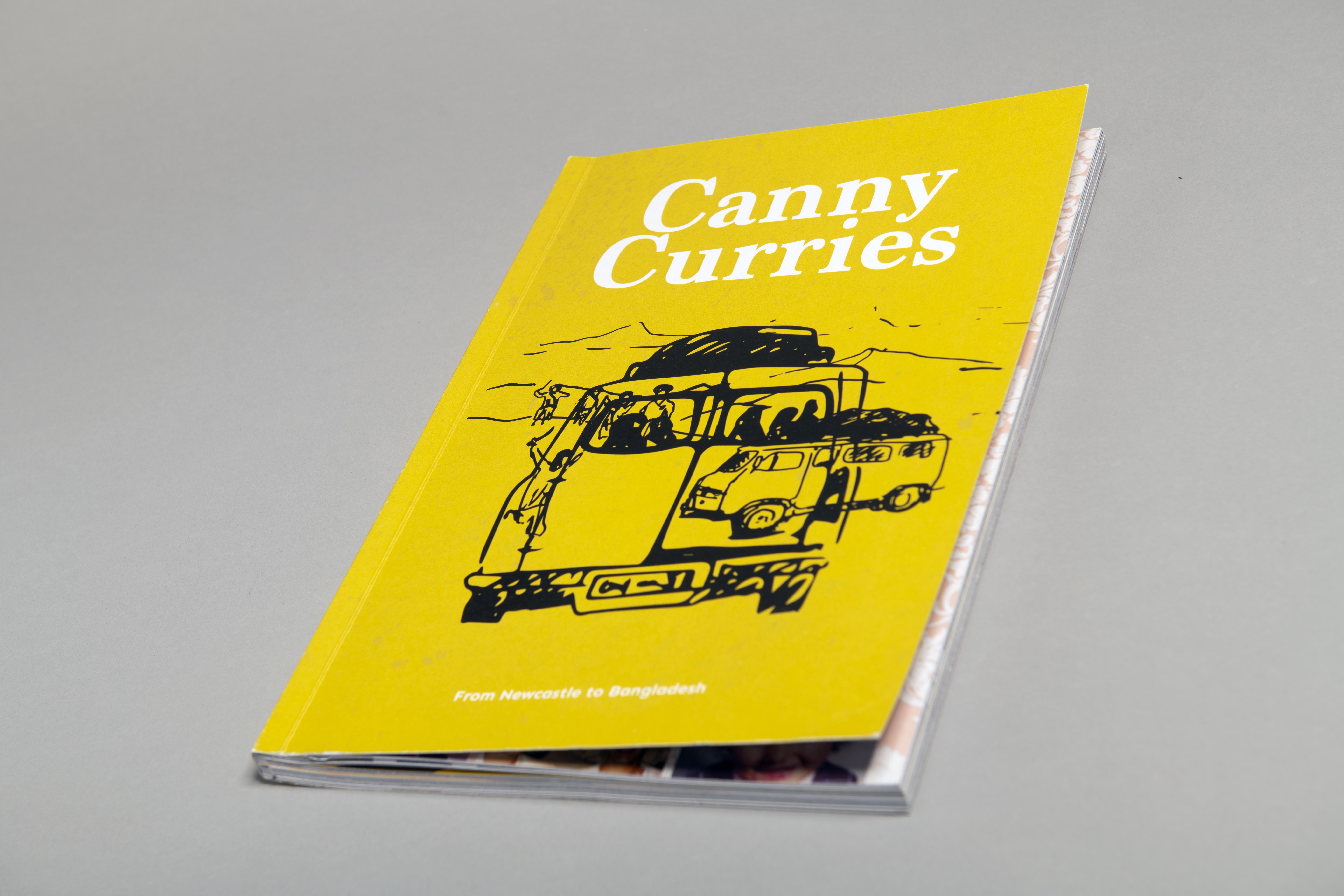
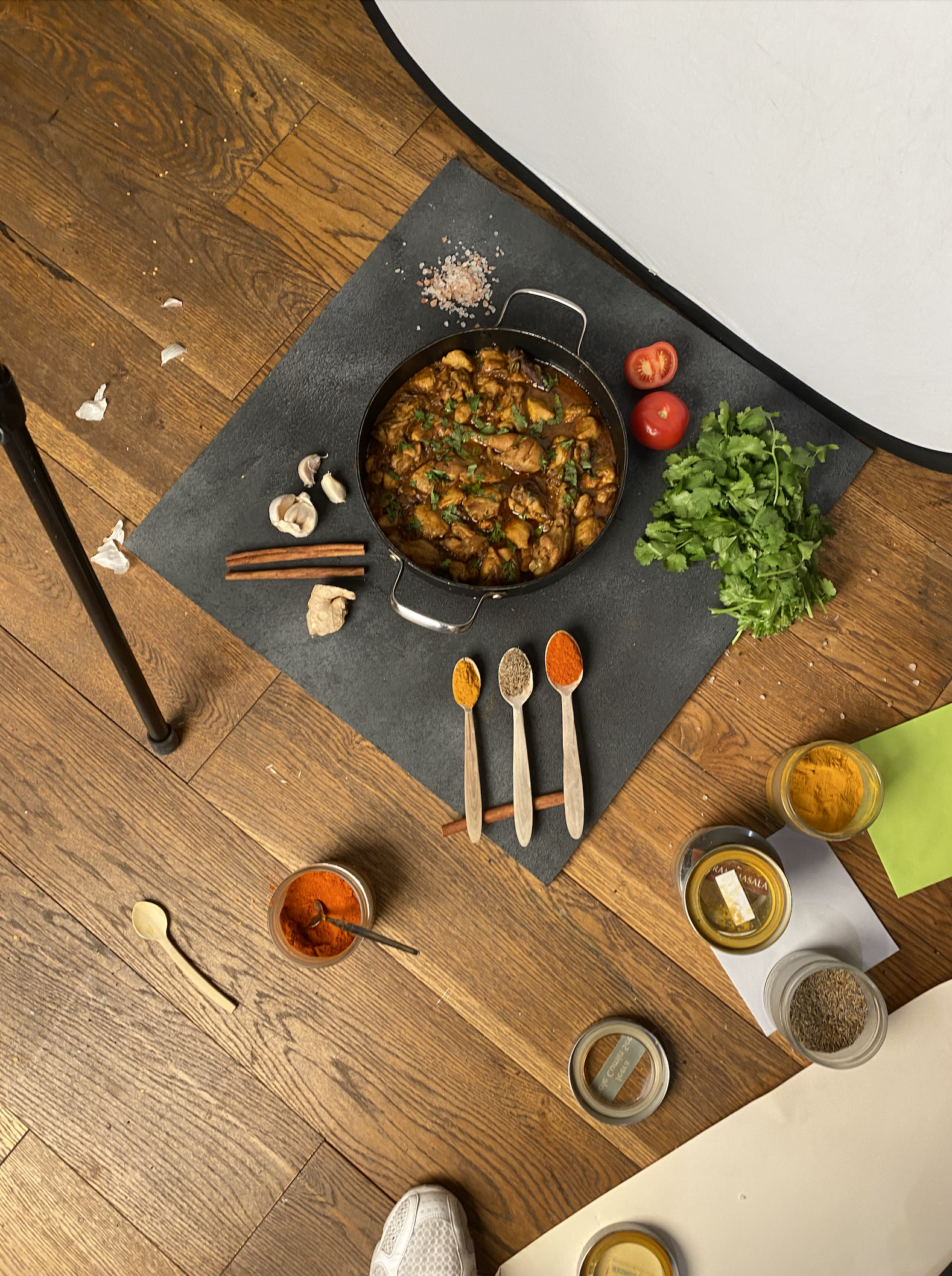
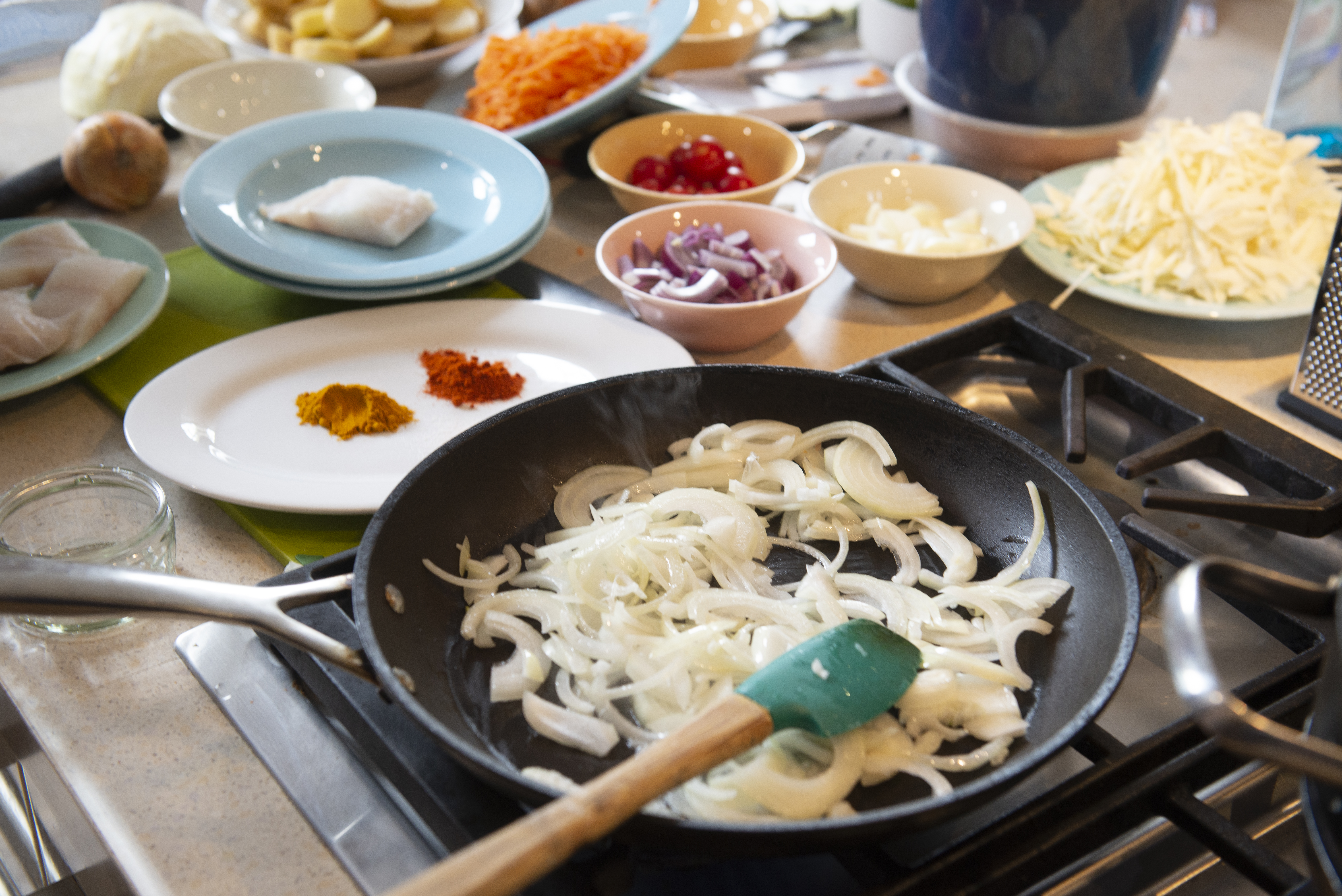
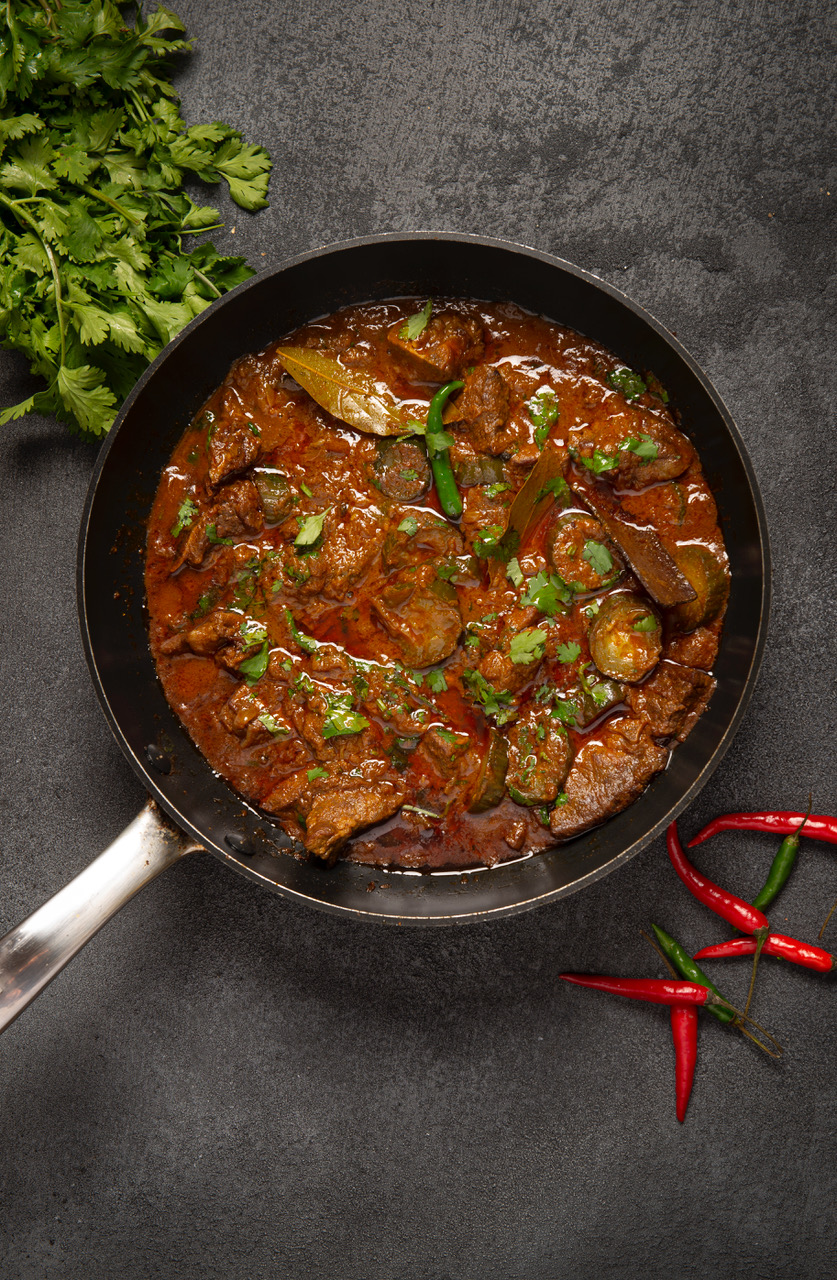
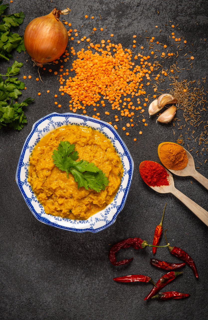
Curries is a family recipe book which explores Jay's family’s mix of Bengali and Geordie heritage. The book follows a journey that Jay’s grandparents took to Bangladesh with their five children in a converted Ford transit van in 1969. Driving from Newcastle through France, Switzerland, Austria, Hungary, Yugoslavia, Belgium, Turkey, Iraq, Iran, Afghanistan, West Pakistan, India and finally to East Pakistan (Bangladesh).
Designer Statement
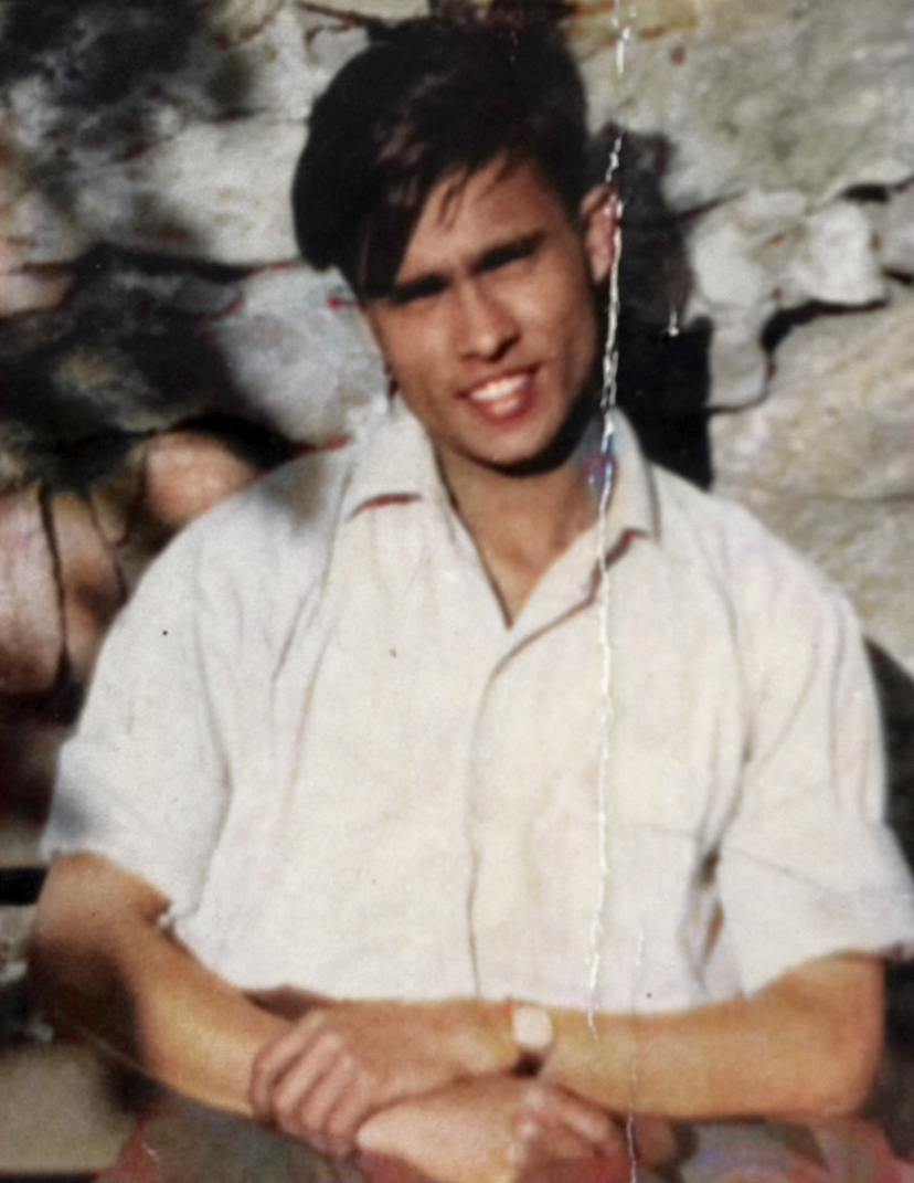
Told through memories and stories from over the years this project was massively important to me in documenting my family history. The mixing of two cultures was extremely influential in the upbringing of my mam and her siblings and continued through to mine. Learning recipes that have been passed down from my grandad to my mam inspired me to design Canny Curries for my final project at Ravensbourne. I hope to continue to develop this project over the next year where you will hopefully be able to purchase a copy of Canny Curries.











LICKD
2021
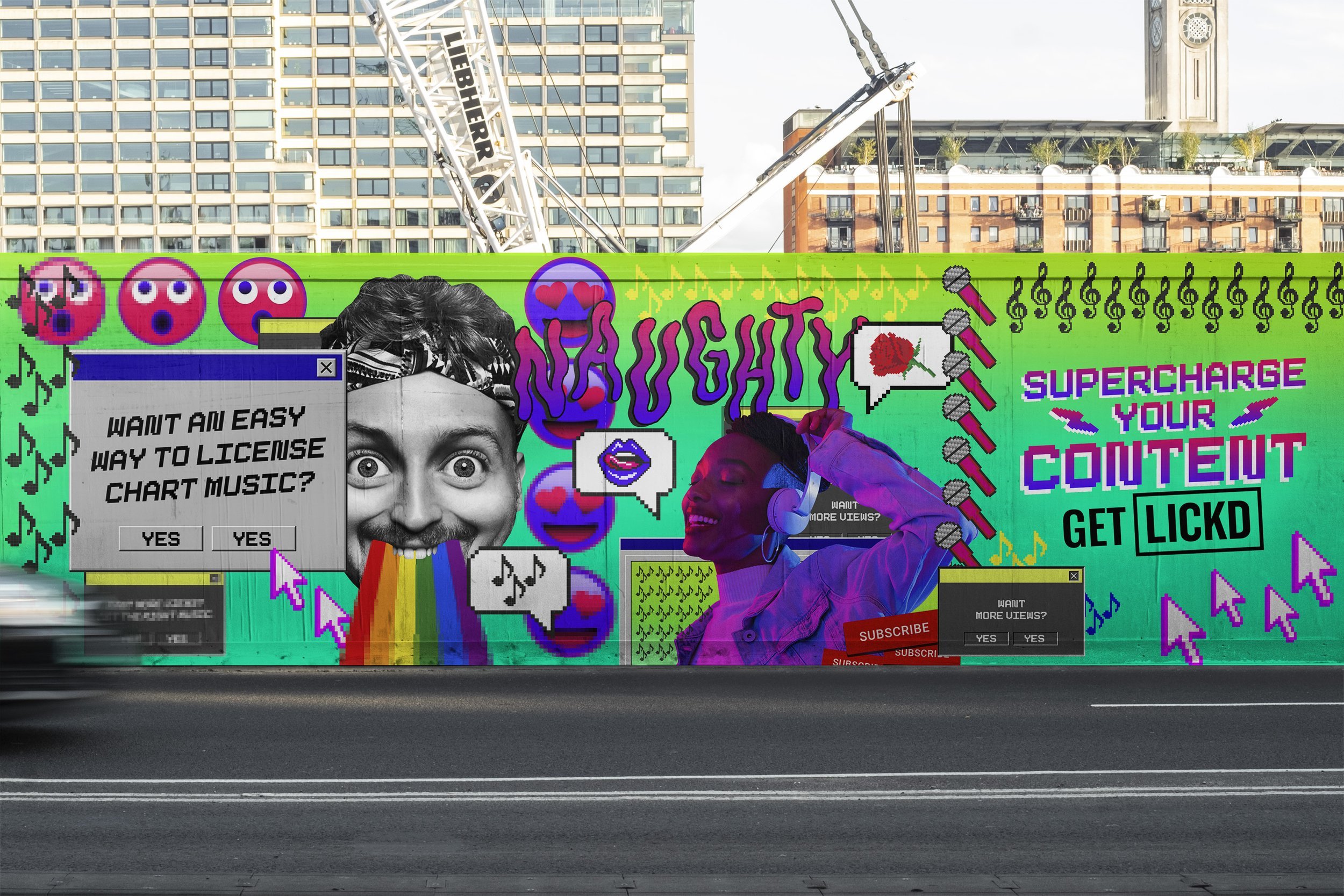
Lickd is a music platform available to creators to use for their content, with over 100k royalty-free tracks. I helped to design graphics for social and video content posted across Lickd’s channels.
Designers: Jay Halim, Ramsey Chapman
Creative Directors: George Barlett, Charlie Lindsay


Production of videos: The Berry
GET LICKD / CAROLINA from Truan
Variations of artist titles I created for the videos





Social headers for different channels


